
Key takeaways
- Apple's design guidance for iPhone apps lives in the Human Interface Guidelines, while App Store approval follows the separate App Store Review Guidelines.
- Since June 8, 2026, Apple's guidance rests on 8 design principles, from Purpose and Agency to Craft and Delight.
- Liquid Glass belongs to the control layer that floats above content, never to the content itself.
- Lay out screens by size class rather than by device, so one layout adapts from the smallest iPhone to iPad.
- The key numbers are 17 points (pt) for body text, 44×44 pt for controls by default (28×28 pt minimum) and 4.5:1 contrast for text up to 17 pt.
A product team hands its developers a Figma file for a new iPhone app, built on a user interface (UI) kit from before June 2025, when Liquid Glass entered Apple's iOS design guidelines. Apple has since published the iOS and iPadOS 27 UI kit for Figma, on September 17, 2026, so the file is not wrong, only dated, and every date that makes it so is public. The team is invented for this guide.
Apple's guidance for iOS 27 rests on 8 design principles, a glass layer that keeps controls above content, layouts that adapt by size class, standard components, and fixed numbers for text, contrast and touch targets. Checking screens against those rules is the first step of our iOS app design services, and the dated changes in this guide show where a 2025 file falls behind.
What are iOS design guidelines, and who writes them?
iOS design guidelines are the design rules Apple publishes in its Human Interface Guidelines (HIG) for iPhone apps, covering principles, foundations, patterns, components and inputs.
Apple maintains them on developer.apple.com. The iOS Human Interface Guidelines are not a separate book: the iPhone guidance sits inside one HIG for every Apple platform, in six sections plus a "New and updated" list. Foundations holds the rules most screens touch first: layout and size classes, typography and Dynamic Type, materials, and accessibility and touch targets.
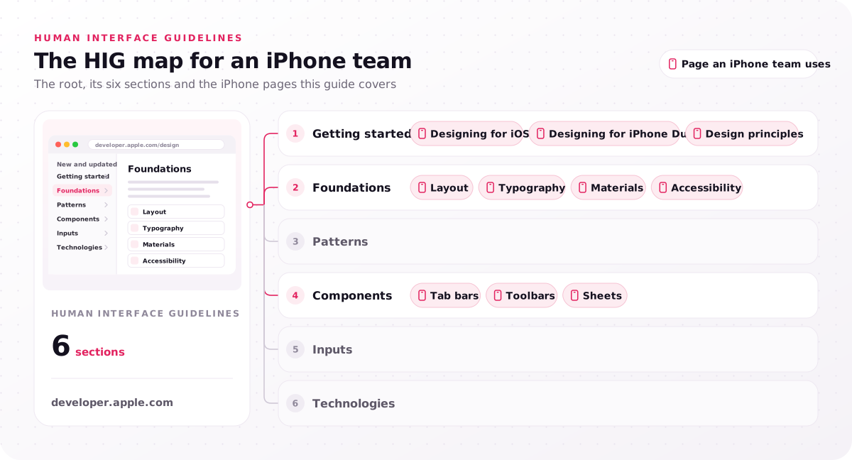
- Getting started: Designing for iOS, Designing for iPhone Duo, Design principles
- Foundations: Layout, Typography, Materials, Accessibility
- Patterns
- Components: Tab bars, Toolbars, Sheets
- Inputs
- Technologies
For an iPhone team, "Designing for iOS" frames the rest: a high-resolution screen held in one or both hands no more than a foot or two away, input through Multi-Touch gestures, virtual keyboards and voice, and system features such as widgets, Home Screen quick actions, Spotlight and Shortcuts. Its best practices ask apps to limit onscreen controls, keep main controls within reach in the middle and bottom of the screen, and adapt to orientation, Dark Mode and Dynamic Type (the system text-size setting).
People who search iOS guidelines mean one of two documents: the HIG, which covers design, and the App Store Review Guidelines, which set the rules for App Store approval. Start with the principles in the next section, because every other rule traces back to them.
What is the iOS design system called?
Apple calls its design guidance the Human Interface Guidelines, and since iOS 26 the visual language behind it is built on the Liquid Glass material.
So yes, Apple has a design system in practice: the guidance in the HIG, standard components that adopt it automatically, and Apple Design Resources, which holds UI kits, San Francisco (SF) fonts and the SF Symbols icon library. Apple's iPhone design guidelines are the rules; the kits are what designers open in Figma or Sketch.
Are general UI design guidelines the same as Apple's?
No. General user interface rules apply to any screen, while Apple's design guidelines add iPhone rules for components, sizes and materials.
Jakob Nielsen's 10 usability heuristics and Ben Shneiderman's 8 golden rules are the usual answers to "10 guidelines for user interface design", and they fit a website as well as a kiosk. They never say how large a button must be on an iPhone; the HIG does, so use the general lists for usability reviews and Apple's pages for every iPhone decision.
Which 8 design principles sit behind iOS design guidelines?
For iOS 27, Apple's iPhone design guidelines rest on 8 design principles, Purpose, Agency, Responsibility, Familiarity, Flexibility, Simplicity, Craft and Delight, reintroduced in the HIG on June 8, 2026.
These eight are Apple's core principles today, and each design principle turns into a concrete decision on an iPhone screen. Many guides still list clarity, deference and depth as Apple's principles; Apple's current page lists the eight in the table instead.
The table pairs each principle with what it asks of an iPhone app; quoted phrases are Apple's, and the rest is our reading of Apple's page.
| Principle | What it asks of an iPhone app |
|---|---|
| Purpose | Know what the app is for, focus on making its most important features great, and check that each design choice serves that purpose |
| Agency | Let people skip guided flows and make undo easy, so they stay in control |
| Responsibility | Protect privacy and be transparent about what the app does with data |
| Familiarity | Use system patterns and keep consistency in visuals, interactions and feedback |
| Flexibility | Build accessibility in from the start and support many input methods |
| Simplicity | "Simplicity isn't minimalism", so keep what matters close at hand, let the rest recede and establish a clear hierarchy |
| Craft | Prototype early, test in real settings and keep current with the platform |
| Delight | "Don't mistake delight for decoration", so add moments that help rather than ornaments |
On an iPhone, a forced five-screen onboarding breaks Agency, and a Skip button on the first screen restores it. Craft asks teams to keep current with the platform, so the next section dates what changed.
What changed in the iOS design guidelines for iOS 27?
The iOS design guidelines changed in two waves: iOS 26 added Liquid Glass in June 2025, and the June 2026 update for iOS 27 reintroduced the principles and refined search guidance.
The new iOS design, in short, is glass controls floating over content, eight stated principles and layouts that resize for a folding iPhone. Apple records a guideline update date in the change log at the foot of most HIG pages and lists the dates on its design "What's new" page, so any design file can be checked against a date.
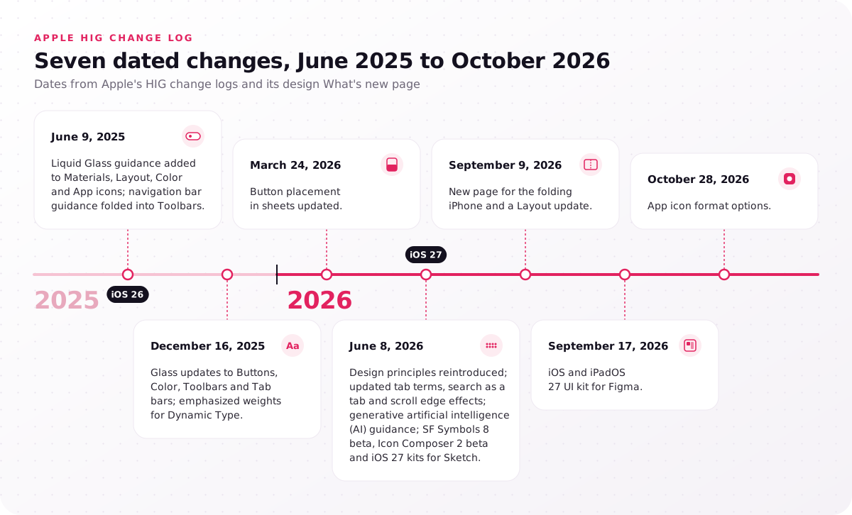
- June 9, 2025: Liquid Glass guidance added to Materials, Layout, Color and App icons; navigation bar guidance folded into Toolbars.
- December 16, 2025: glass updates to Buttons, Color, Toolbars and Tab bars; emphasized weights for Dynamic Type.
- March 24, 2026: button placement in sheets updated.
- June 8, 2026: design principles reintroduced; updated tab terminology, search-as-a-tab and scroll edge effect guidance; generative artificial intelligence (AI) guidance; SF Symbols 8 beta, Icon Composer 2 beta and iOS 27 kits for Sketch.
- September 9, 2026: new page for the folding iPhone and a Layout update.
- September 17, 2026: iOS and iPadOS 27 UI kit for Figma.
- October 28, 2026: app icon format options.
If your Figma file predates June 2025, the next two sections are where it will differ most.
How does Liquid Glass change iOS interface design?
Liquid Glass is the material the iOS design guidelines reserve for controls and navigation in iPhone apps, a layer that floats above content while content scrolls underneath.
Apple's Materials page names two material types. Liquid Glass forms the control layer for tab bars, sidebars and controls, while standard materials, built from blur, vibrancy and blending modes, separate elements inside the content layer. Apple says to keep the glass out of the content layer and to use it sparingly on custom controls; standard components adopt it automatically.
The split creates hierarchy, because controls read as a plane above the content they act on. Apple's Layout page gives the same instruction: separate controls from content with the glass and a scroll edge effect instead of solid or semi-opaque bars.
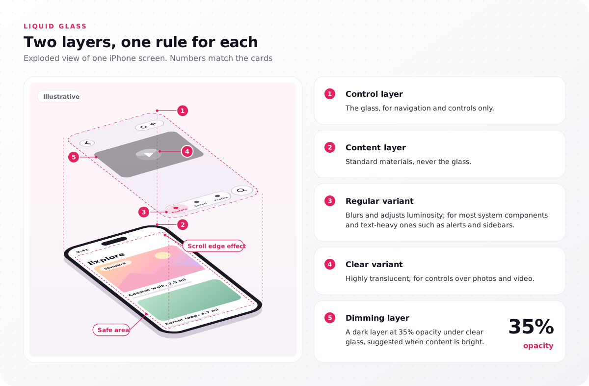
- Control layer: the glass, for navigation and controls only.
- Content layer: standard materials, never the glass.
- Regular variant: blurs and adjusts luminosity; for most system components and text-heavy ones such as alerts and sidebars.
- Clear variant: highly translucent; for controls over photos and video.
- Dimming layer: Apple suggests a dark layer at 35% opacity under clear glass when the content beneath is bright.
Each Liquid Glass variant answers a legibility question: regular wherever people read text on the control, clear only where the photo or video beneath it is the point. Scroll edge effects keep controls readable as content passes under them. Three mistakes break these rules:
- Glass cards in the content feed, because the content layer belongs to standard materials, and glass there blurs the line between control and content.
- Several custom glass controls stacked together, because Apple asks for sparing use, and each extra pane competes with the system controls.
- Clear glass over a bright photo with no dimming layer, because the text on the control loses contrast.
Check one screen of your app today: is anything in your content layer made of glass?
How do you organize an iPhone layout?
Organize an iPhone app layout by importance, top and leading side first, then group related items, respect the safe area and adapt by size class, per Apple's Human Interface Guidelines.
Reading order runs top to bottom and leading to trailing, so alignment and indentation show hierarchy, while space, containers or separators show groups, and progressive disclosure keeps secondary detail one step away. The safe area is the part of the screen not covered by hardware such as the Dynamic Island or by system bars; layout margins and guides keep content inside it.
Apple's Layout page, updated September 9, 2026, asks layouts to handle screen sizes, orientation, Display Zoom, text-size changes and right-to-left languages, and to be determined by size class, not device type or orientation. The horizontal size class labels the available width as compact or regular, so size classes give adaptability across screen sizes that a fixed artboard lacks. The iOS design guidelines treat every iPhone and iPad as one adaptive layout; test the largest and smallest layouts first.
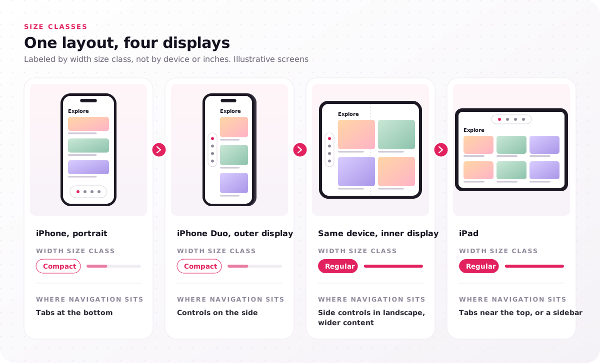
| Display | Width size class | Where navigation sits |
|---|---|---|
| iPhone, portrait | Compact | Tabs at the bottom |
| iPhone Duo, outer display | Compact | Controls on the side |
| Same device, inner display | Regular | Controls on the side in landscape, wider content |
| iPad | Regular | Tabs near the top, or a sidebar |
A file made before June 2025 has no glass control layer, and if it was drawn at fixed widths, moving it to size classes is structural work, not a reskin. That is why we start every iOS engagement with a HIG review of the current app or concept, a 3–5 day step.
How does iPhone Duo change iPhone layouts?
iPhone Duo, Apple's first folding iPhone, adds an outer and an inner display, so an iPhone app must resize between compact and regular width without changing what it does.
On the folding model, the system places toolbars and tab bars on the side of the outer display and of the inner display in landscape, and Apple pairs a compact width layout with the outer display and a regular width layout with the inner one. Apple asks teams to build screens that resize and to keep functionality the same across poses, and standard components adapt automatically.
What changes for iPad apps?
On iPad, Apple's iPadOS guidance moves the tab bar near the top, where it can convert to a sidebar, and assumes people sit within about 3 feet of the screen.
Apple asks iPad apps to minimize modal views and to support keyboard, trackpad and Apple Pencil input beside touch. Complex apps can let the tab bar convert to a sidebar, or use a navigation split view for a sidebar alone, to list many sections.
Open your app at the largest text size on the smallest layout; that single test shows where text truncates or overlaps.
Which navigation components fit Apple's design guidelines?
In an iPhone app, the iOS UI guidelines put top-level sections in a tab bar, actions on the current view in a toolbar and focused tasks in sheets.
Picking the wrong component, such as an action placed among the tabs or navigation inside a toolbar, is a quick way for an app to stop feeling native. Apple's Tab bars page reserves the bar for navigation, never actions, and keeps it visible in every section except under a modal view. An app with fewer tabs is easier to use, because with too many the trailing tab becomes More; never disable or hide a tab, and explain an empty section inside it.
Labels are single words where possible, icons come from SF Symbols so they adapt to compact and regular widths, and badges flag only critical information. In iOS the bar floats above content at the bottom on Liquid Glass, can minimize as people scroll, with an accessory such as the Music MiniPlayer, and can give search its own tab at the trailing end.
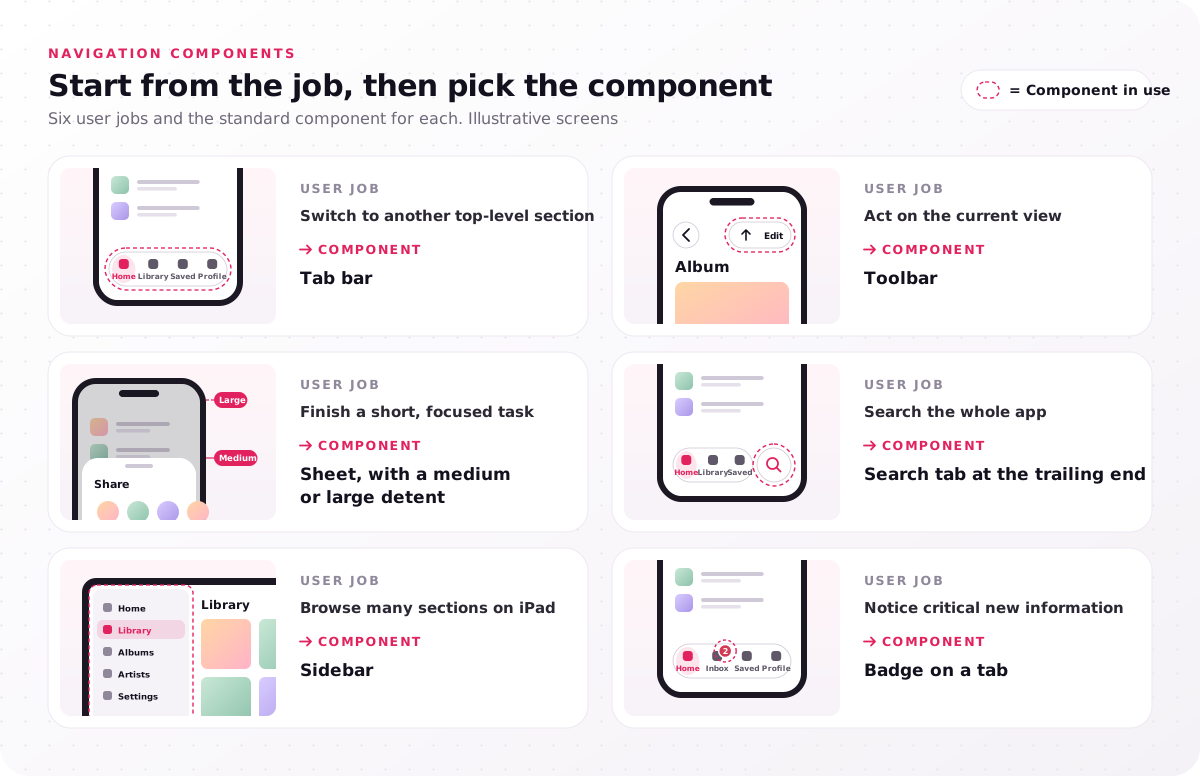
| User job | iOS component |
|---|---|
| Switch to another top-level section | Tab bar |
| Act on the current view | Toolbar |
| Finish a short, focused task | Sheet, with a medium or large detent |
| Search the whole app | Search tab at the trailing end |
| Browse many sections on iPad | Sidebar |
| Notice critical new information | Badge on a tab |
Toolbars carry actions on the current view, and since June 9, 2025 Apple's navigation bar guidance lives on the Toolbars page. Sheets open at a sheet detent, medium or large; every sheet supports large automatically, and on iPhone the medium detent suits progressive disclosure, as the share sheet shows. Start from these native components before drawing custom ones, because standard components inherit the glass and new layouts on their own.
List what each of your app's tabs does; any tab that triggers an action belongs in a toolbar.
What numbers do the iOS design guidelines set?
For iPhone apps, iOS design guidelines set 17 points (pt) for body text, 44×44 pt for controls by default (28×28 pt minimum) and 4.5:1 text contrast up to 17 pt.
Most iOS UI guidelines for iOS 27 come down to these numbers, and Apple's Typography and Accessibility pages print them with qualifiers that matter. The default text size of 17 pt has an 11 pt minimum. The default control size is 44×44 pt (about 7 mm on an iPhone screen; Apple gives points, not millimeters), while 28×28 pt is the minimum control size, not a target. The contrast ratio drops to 3:1 only for text at 18 pt or bold.
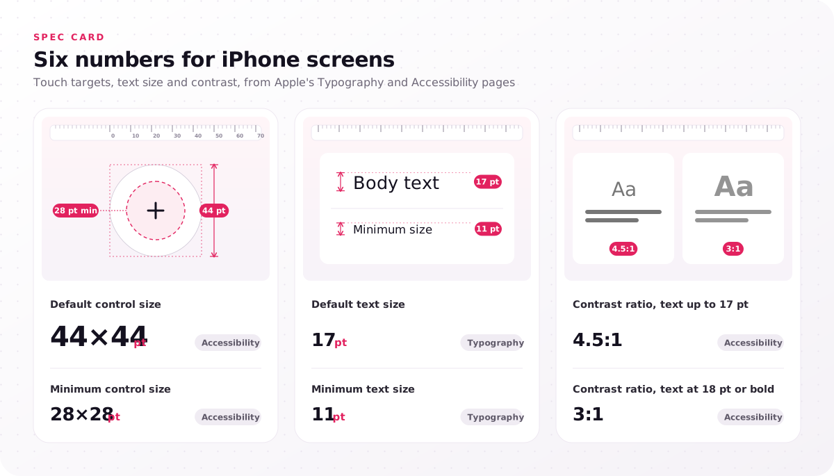
| Number | Value | Apple page |
|---|---|---|
| Default text size | 17 pt | Typography |
| Minimum text size | 11 pt | Typography |
| Default control size | 44×44 pt | Accessibility |
| Minimum control size | 28×28 pt | Accessibility |
| Contrast ratio, text up to 17 pt | 4.5:1 | Accessibility |
| Contrast ratio, text at 18 pt or bold | 3:1 | Accessibility |
Measure the touch target size of your smallest control in the Figma file; anything under 44×44 pt needs a reason.
What are the typography guidelines for iOS?
The HIG typography guidelines for iOS use Apple's San Francisco family, support Dynamic Type at every size and keep truncation minimal when text grows.
The family includes SF Pro, SF Compact, SF Mono and others, plus rounded variants, and 17 pt is the default font size for body text. Custom fonts are allowed when they stay legible and respect the minimum sizes, and since December 16, 2025 Dynamic Type includes emphasized weights. On an iPhone screen, test a long label at the largest accessibility size: it should wrap rather than end in an ellipsis.
How do accessibility rules apply on iPhone?
Accessibility on iPhone means text that scales with Dynamic Type, a VoiceOver label on every control, contrast that passes in light and Dark Mode, and controls large enough to tap.
Where default colors fall short of the contrast ratio, Apple asks for higher-contrast versions that appear when people turn on Increase Contrast. Our accessibility spec sets rules for Dynamic Type, VoiceOver labels and Dark Mode, for example body text that scales across every Dynamic Type size. Large targets matter beyond the defaults too: our Elia Wellness case study describes a pre-course questionnaire that works on tablets, with "large touch targets and simple rating scales" for a 50+ audience. Turn on VoiceOver and the largest text size on a test iPhone, then walk your main flow once.
How is iOS design different from Android's Material Design?
An iPhone app follows Apple's Human Interface Guidelines and an Android app follows Google's Material Design 3, so navigation, controls and typography differ, and neither is better in general.
An app that copies one platform's patterns onto the other feels foreign to its users. The table compares four points where the two systems differ, with the Android target taken from Android's developer accessibility page.
| Point | iOS | Android |
|---|---|---|
| Guidelines | HIG | Material Design 3 |
| Published by | Apple | |
| Recommended touch target | 44×44 pt by default | 48×48 density-independent pixels (dp) |
| Top-level navigation | Tab bar floating at the bottom on Liquid Glass | Navigation components defined in Material Design 3 |
For one user experience (UX) project across both platforms, compare our mobile app UI UX design services, which design to the HIG and Material Design 3 together. A web storefront answers to a third number: Web Content Accessibility Guidelines (WCAG) 2.2 level AA asks for targets of at least 24×24 CSS pixels, and in e-commerce UI UX design that minimum applies to add-to-cart buttons.
Is iOS UI better than Android?
No. Neither platform's UI is better in general; people judge an iPhone app against the iOS apps they already use, and an Android app against Android.
Familiarity, one of Apple's 8 principles, explains why: matching the platform people know shortens the time they spend learning an app. If you ship on both, decide screen by screen which patterns are shared and which follow each platform.
How do you apply iOS design guidelines step by step?
Apply iOS design guidelines to an iPhone app in 7 steps, from Apple's current UI kit through flows, components, type, testing and specs to a TestFlight build review.
Designing a UI for an iOS app that feels native on iPhone follows the same order, because each step depends on the one before.
- Start from Apple's current kit. Download the iOS and iPadOS 27 UI kit for Figma, released September 17, 2026, or the Sketch version from Apple Design Resources, which offers an App Icon Template as well.
- Map flows to sections and actions. Each top-level section becomes a tab in the app's bottom bar, and each action on a view goes to a toolbar.
- Use native components first. Standard components pick up the glass and folding-display layouts automatically, so every custom component needs a reason.
- Set type, contrast and targets. Define text styles that scale, check each color pair against the contrast table and size every control at 44×44 pt.
- Prototype and test. In our process, a clickable iPhone prototype is tested with 5 users per round in moderated sessions.
- Write handoff specs. Annotate each component with the view it maps to, for example TabView, NavigationStack or List.
- Review the first TestFlight build. Compare the build against the design, screen by screen, before release.
Steps 1 and 3 cost nothing and catch problems early, while step 5 is where outside help pays off. Our iOS engagements follow a 5-step process from HIG review to SwiftUI handoff, and steps 2 to 7 here sit inside its last four steps.
What is SwiftUI used for?
SwiftUI is Apple's framework for building app interfaces in Swift code across Apple platforms, and developers, not designers, write it.
Designers deliver SwiftUI-ready specs that map each component to a view, such as TabView, and the developers write the code. Step 6 is where the two roles meet, so name the view in the spec rather than leaving developers to guess it.
When does an iPhone app need a HIG review?
An iPhone app needs a HIG review against the iOS design guidelines when it predates Liquid Glass, App Store reviews cite confusing navigation, or iPhone Duo support is planned.
Six signals in the current app point to one:
- Custom opaque bars, or glass inside the content layer, because the first predates the iOS 26 material rules and the second breaks them.
- App Store reviews that mention confusing navigation, because users are reporting a structure problem, not a styling one.
- Actions inside the tab bar, because Apple reserves it for navigation.
- Text that truncates or overlaps at large Dynamic Type sizes, because the layout was drawn at one text size.
- Fixed-width layouts, because they will not resize for a folding display or a future iPad version.
- Android patterns on iPhone, because they break Familiarity, the principle people feel first.
Start with a HIG review of your current app: we check the current app or concept against Apple's Human Interface Guidelines, for example navigation, modality and the 44×44 pt hit target, in 3–5 days, before any redesign begins. Adding iPad layouts or extra test rounds raises the price, and our iOS project price ranges show by how much.
Put your design file's last-modified date beside the timeline in this guide, and every stop after it marks guidance your screens were not drawn against. When that list runs long, or folding-display and iPad support sit on the roadmap, our iOS app design work opens with that HIG review. Bring the screens your users struggle with and the devices you plan to a free consultation; every project begins there, and a fixed-scope proposal follows.
FAQs
Are the iOS design guidelines required for App Store approval?
No. The HIG is design guidance, while approval follows the App Store Review Guidelines, whose section 4, Design, sets "minimum standards for approval" and whose pre-submission checklist asks developers to check their app against other documentation, including the Human Interface Guidelines. An app that ignores the HIG risks rejection where it also breaks a review guideline, for example 4.1 on copycat apps or 4.9, which points Apple Pay apps to the HIG. Some review rules reach the screens directly: App Store guideline 5.1.1(v) requires in-app account deletion in any app that supports account creation, so our startups UI UX design work puts a delete-account flow into the settings of a minimum viable product (MVP).
Is there an official iOS style guide?
Yes. The official iOS style guide is the Human Interface Guidelines, and the files that go with it sit in Apple Design Resources: the iOS and iPadOS 27 UI kit for Figma and Sketch, the App Icon Template, SF Symbols and Apple's fonts. The separate Apple Style Guide covers writing, not interface design.
How often do the iOS design guidelines change?
Several times a year. The largest updates arrive in June with Apple's Worldwide Developers Conference (WWDC) and in September with new hardware, and smaller ones land between them, as the timeline in this guide shows. Most HIG pages show their own dated change log, so check the page you design against rather than a summary.
Do the iOS design guidelines cover iPad and iPhone Duo?
Yes. Their platform scope covers both: the HIG has separate "Designing for iPadOS" and "Designing for iPhone Duo" pages, and Apple treats the folding model as iPhone, so the iOS patterns apply to it. The layout section of this guide explains how size classes carry one layout across all of them.
Can an iPhone app use a custom font and brand colors?
Yes. Apple allows custom fonts that stay legible, meet the minimum sizes and scale with the text-size setting, and its Branding page, refined on September 9, 2026, covers brand color. Keep tab labels in a color that does not match bright content beneath them, and keep a system font for dense interface text wherever the brand allows.