Key takeaways
- Start a SaaS product redesign from the lifecycle metric that stalled, not from how dated the product looks.
- Pick the smallest scope that reaches that metric: flow fix, lifecycle redesign or platform rebuild.
- Record baseline numbers, a success target and a rollback trigger for every flow before design starts.
- Test existing power users and new trial users separately; they answer different questions.
- Roll out in gated steps behind a feature flag, with an old-UI toggle and a published sunset date.
The most expensive myth in software as a service (SaaS) is "our product looks dated, so we need a SaaS product redesign." Customers rarely cancel over fonts; they cancel when onboarding never reaches the first value moment or a weekly task takes too long. Scope the redesign around the subscription metric that stalled, record a baseline, protect power users and workspace admins, and release the new design behind gates you can roll back.
What is a SaaS product redesign, and what is it not?
A SaaS product redesign changes the flows, structure and screens behind a subscription metric; a new palette on unchanged flows is a user interface (UI) refresh.
A UI refresh changes how the product looks in a sales demo. A user experience (UX) redesign changes what people do between sign-up and renewal, where churn starts.
A redesign can touch three layers:
- Visual layer. Typography, color, spacing and components; rarely why a metric stalls.
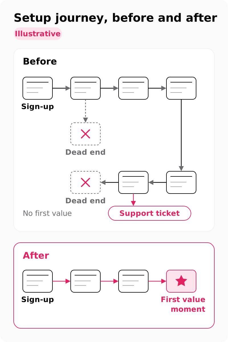
- Flow and structure layer. The onboarding flow, core workflows, navigation, settings and billing, where most activation and retention problems live.
- Platform layer. Information architecture, roles and permissions, the component library and the front end.
Every change in a SaaS redesign lands on people who already pay, mid-subscription. That is why rollout matters as much as the screens, and why our SaaS UX design services start from a metric rather than a mood board.
Which metrics tell you a SaaS redesign is due?
A SaaS redesign is due when a lifecycle metric stalls and users can show you why: trials stuck before first value, falling weekly use, flat upgrades or rising setup tickets.
Each stage has its own trigger and its own proof that the cause is UX:
| Lifecycle stage | Trigger metric | Evidence the cause is UX |
|---|---|---|
| Activation | Trial accounts never reach the first value moment; time-to-value grows | A funnel step in Amplitude or Mixpanel where most trials stop; session recordings of setup |
| Retention | Weekly active use drops after month 1; retention rate falls by cohort | Feature-usage data in Pendo; churn-survey reasons such as "too slow" or "can't find anything" |
| Upgrade | Trial-to-paid conversion and plan upgrades stay flat | Accounts hit plan limits but never open the plan comparison |
| Support load | Tickets about setup, navigation and "where is…" rise | Ticket tags and help-center search terms |
Use the goals-signals-metrics process from the Google HEART framework (Rodden, Hutchinson and Fu, 2010), which covers happiness, engagement, adoption, retention and task success, to pick one goal, one signal and one metric per stage. Ten metrics per stage hide the one that moved.
Sales often blames missing features when the interface is the cause. At ToolsGroup, 30+ stakeholder interviews traced 75% of sales losses to the UI, not to missing features.
When churn interviews name price, positioning or a missing integration instead, a redesign will not move the number.
Flow fix, lifecycle redesign or platform rebuild?
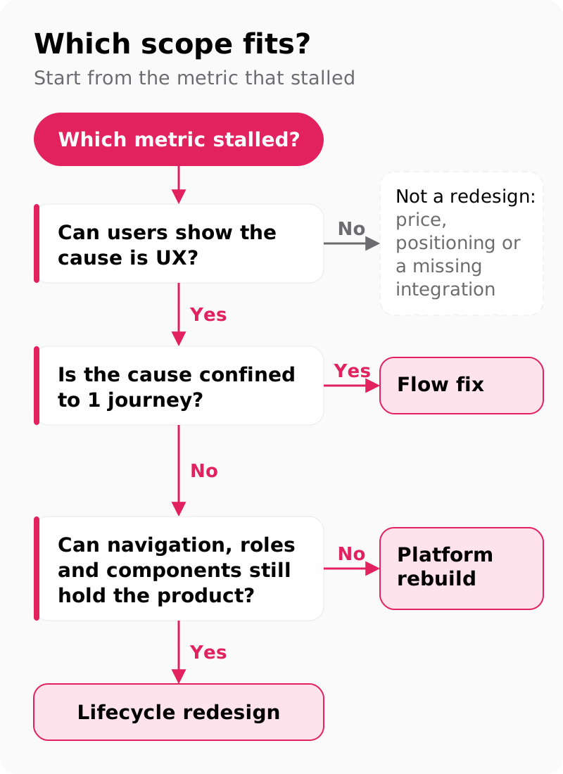
Pick the smallest scope that reaches the stalled metric: a flow fix for one journey, a lifecycle redesign when several stages leak, a platform rebuild when structure fails.
Scope a SaaS product redesign with your own data. If trial accounts stall during setup while every other stage holds, the cause sits in one journey: a flow fix on onboarding. If paying accounts also drift away after month 1, two stages leak: a lifecycle redesign. A platform rebuild earns its risk only when navigation, user roles and components can no longer hold the product, for example when every new feature needs a new menu.
The tiers differ most in who feels the change:
| Scope tier | What changes | Who feels it | Typical duration |
|---|---|---|---|
| Flow fix | One journey, such as the onboarding flow or the upgrade path | New trials or a single user role | 4–8 weeks |
| Lifecycle redesign | Onboarding, core workflows, pricing page and cancellation flow | Trials, paying users and admins | 4–8 weeks |
| Platform rebuild | Navigation, roles, the design system and core workflows | Every user and every admin | 8–16 weeks |
At our rates, an onboarding redesign for one user role sits near $25,000, a full lifecycle redesign near $60,000, and work that needs a component library moves to $60,000–$180,000. Every tier ends with a Web Content Accessibility Guidelines (WCAG) 2.2 level AA checklist for each screen.
Keep a front-end rebuild a separate decision (see the FAQs). Bring your funnel export or the three flows you suspect to a free consultation and leave with a fixed-scope proposal; the discovery step of our 4–8 week SaaS UX design engagement then sets one target metric per lifecycle stage.
How do you set a baseline before anyone opens Figma?
Record current numbers for the 3–5 flows in scope, with success and rollback thresholds, before design starts; without baseline metrics, nobody can prove the redesign worked.
The baseline sheet holds one row per flow:
- Flow name and the segment that runs it
- Current completion rate
- Time on task
- Related ticket volume per month
- Target after launch
- Rollback trigger: the number that pauses the rollout
Check instrumentation next, because a SaaS product redesign is judged by events you already track. Renamed screens and merged steps break old funnels, so map every old event name to its new one before launch, or the comparison measures your tracking plan instead of your design.
Then talk to customers. We run Jobs to be Done interviews with 5–8 customers to separate the job ("send the weekly pipeline report to my manager") from today's interface ("export, filter, paste into slides"). They show which screens users defend out of habit and which the job needs.
In week 1, gather read access to Amplitude, Mixpanel or Pendo, a recent support ticket export, the raw churn-survey text and a list of top accounts by seat count, so the riskiest customers are known before a screen changes.
Which users does a redesign put at risk?
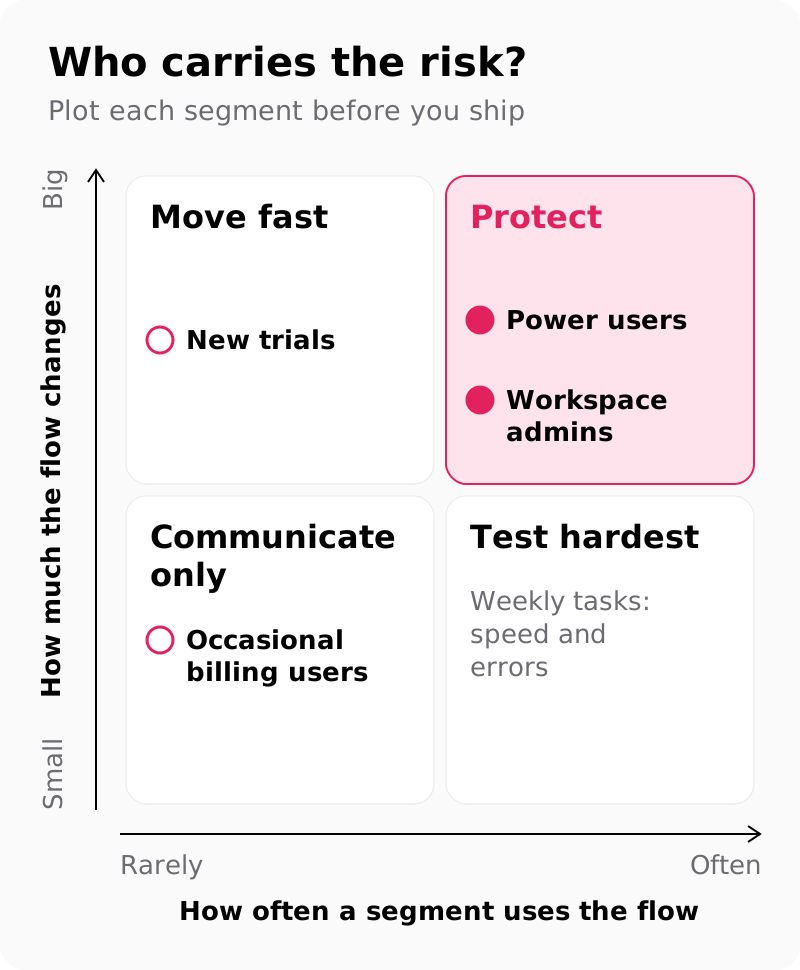
Three groups carry the risk in a SaaS product redesign: power users whose muscle memory breaks, workspace admins who configured the product for a whole team, and accounts near renewal.
Expect change aversion on day one. Aaron Sedley's GV Library article defines change aversion as a negative short-term reaction to changes in a product, and Google limits it with usability studies, internal dogfooding and partial launches. So day-1 complaints are not the signal. Watch whether task success and return usage recover over the following weeks: if they recover, it was aversion; if they stay below baseline, the design is worse.
Business-to-business (B2B) products add workspace admins, who set up roles, saved views, custom fields and integrations for everyone else. When migration drops a saved view, the admin absorbs the whole team's complaints, and churn risk multiplies per account. Carry those settings and keyboard shortcuts through migration, and brief admins before end users see anything. Our page on admin and permission design in SaaS UI UX design goes deeper on roles.
Keep accounts inside their renewal window on the interface they know until the renewal closes.
How do you test with existing users and new trials?
Run two separate tests: existing users repeat weekly tasks in the old and new versions, and people new to the product try onboarding in the new version only.
When you redesign a SaaS product, existing power users tell you about speed and errors on familiar tasks, and new users tell you about learnability on the way to the first value moment. One mixed round averages away both answers.
We test 5 participants per round with a Figma prototype in Maze. Per Nielsen Norman Group, 5 users find most usability problems in a qualitative round, and 3–4 per group suffice when a single study covers two distinct groups. Because the two groups get different tasks here, we run them as separate rounds.
Score each round with the System Usability Scale (SUS), John Brooke's 10-item questionnaire, comparing old against new for existing users. A mean SUS score of 68 is the widely used benchmark for average usability, so read both scores against it.
When power users are slower on day one while new users succeed, do not roll back. Plan a transition aid: a "what moved where" panel, the old keyboard shortcuts and an admin preview. For a larger test program, see our usability testing services.
How do you roll out a SaaS redesign without a churn spike?
Ship in gated steps (internal use, opt-in beta with a switch back, a feature-flag percentage rollout, then a dated old-UI sunset), advancing only when baseline metrics hold.
- Internal use. Your team runs the new flows on real work. Gate: no blocking bugs; every event fires under its new name.
- Opt-in beta with an old-UI toggle. Invite accounts, admins first. Gate: completion rate and time on task match the baseline, and the switch-back rate stays under your threshold.
- Percentage rollout behind a feature flag. Feature flags release a change to a target segment and widen the audience step by step, as LaunchDarkly describes for soft launches with percentage rollouts. An example ramp, not a norm: 10%, 25%, then 50% of accounts. Gate: new-trial activation rate and related tickets hold for a week per step.
- 100% with the toggle still available. Gate: the switch-back rate falls week over week.
- Old-UI sunset. Remove the old UI on the date you published at step 2.
When a rollback trigger fires, the flag returns to the previous step while the team fixes the flow, with no new deploy.
Communicate alongside the ramp: admin email first, then an in-app notice, a changelog entry and help-center updates, each leading with the job the change makes easier. When someone switches back to the old UI, ask what made them switch.
Which redesign mistakes turn into churn?
The churn-causing mistakes are redesigning for a rebrand, moving navigation and workflows together, skipping the baseline, killing the old UI on day one, renaming silently and stale help docs.
- Starting from a rebrand or a new design system. Start from a stalled metric instead, and extract components from the redesigned flows.
- Moving navigation and core workflows in the same release. Move one, measure, then move the other.
- Launching without a baseline. Every post-launch debate turns into opinion. Fill the baseline sheet in week 1.
- Removing the old UI on day one. Offer a toggle for a fixed window and publish the sunset date.
- Silently renaming objects users search for. Keep the old names as search aliases and label renamed items for one release cycle.
- Leaving help docs, screenshots and onboarding emails on the old UI. Update them in the same release, with one owner for the list.
What should you measure in the first 30 days?
Compare redesigned flows with the baseline every week for 30 days: completion rate, time on task, related tickets, switch-back rate and, for onboarding, new-trial activation rate.
Judge each metric against the thresholds you set before design. Between baseline and target, iterate: fix the step where users stall and ship it behind the same flag. Past the rollback trigger, step the rollout back until the metric recovers.
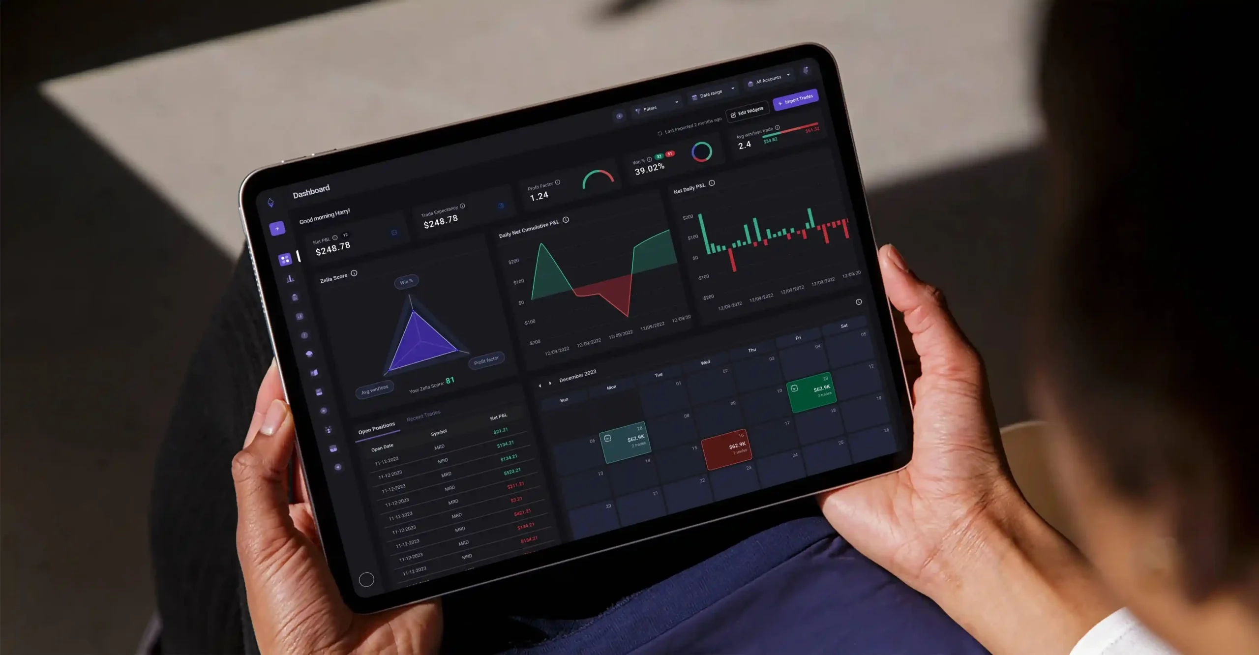
Two of our case studies show what a redesigned path can move. Apex HCM's legacy payroll platform went from 200+ screens to 6 steps, and its VP Product reported: "The new flow cut onboarding time by more than half." TradeZella started with a cluttered interface, a steep learning curve and no onboarding guide; after the TradeZella dashboard and user flows rebuild, user interaction rose 40%, retention 25% and new customers 30%.
If you are sizing a SaaS product redesign now, send us your funnel and we will scope the redesign. A free consultation ends with a fixed-scope proposal, and discovery in our SaaS UX design sprint reviews your product funnels and sets one target metric per lifecycle stage. We have designed 200+ products since 2017.
FAQs
How long does a SaaS product redesign take?
A flow fix or lifecycle redesign takes 4–8 weeks from discovery to handover; a platform rebuild with a design system takes 8–16 weeks. The gated rollout adds weeks on top.
Should you let users switch back to the old UI?
Yes, for a fixed, announced window during the beta and early rollout. The switch-back rate and its reasons are strong signals. Remove the toggle on the published sunset date.
Should you rebuild the front end and redesign at the same time?
No, in most cases. Separate releases keep bugs and design changes apart in your metrics. The exception is a front end that cannot render the new flows at all; then ship both behind one feature flag.
Do you need a design system before a SaaS redesign?
No. Fix the flows first, then extract components from the redesigned screens. A design system joins the scope at the platform-rebuild tier, which runs 8–16 weeks.
How do you announce a SaaS redesign to customers?
Tell workspace admins first, then show an in-app notice and publish a changelog entry. Lead with the job the change makes easier, show what moved where, and state the old-UI sunset date.