Key takeaways
- An e-commerce UX audit scores the whole shopping path, from site search to order confirmation, not only the checkout.
- Pull four data sets first: a Google Analytics 4 (GA4) funnel exploration split by device, the site search log, return and ticket reasons, and Core Web Vitals field data.
- Rank each finding by its severity rating (1 to 4) times the share of affected sessions, divided by the effort estimate in development days.
- Check every audited template against Web Content Accessibility Guidelines (WCAG) 2.2 level AA, including Redundant Entry for billing addresses and Target Size for swatches.
- Our store audit takes 2–3 weeks and costs $5,000–$15,000, the range published on our e-commerce UX design page.
An e-commerce UX audit (a user experience audit of an online store) starts with a test you can run on your own phone in 60 seconds. On mobile data, search for a product with one letter wrong, add a product with sizes or colors to the cart, and reach the payment step as a guest. Each stall points to an area below, because a full audit scores every step from the search box to the order confirmation and ranks each issue by severity, reach and effort.
This e-commerce UX audit checklist covers the data to pull, the checks for each funnel step, scoring and what to send for a quote. Our e-commerce UX design services start with this audit when a store has no funnel evidence yet.
What does an e-commerce UX audit add to a general audit?
An e-commerce UX audit adds store-specific rules, following a shopper from site search to guest checkout and checking each step against e-commerce usability research.
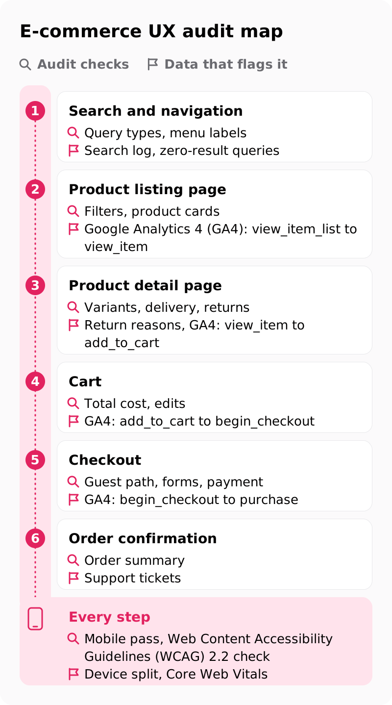
The method is a heuristic evaluation against Jakob Nielsen's 10 usability heuristics, published by the Nielsen Norman Group, plus store rules those heuristics never name, such as showing the total cost before payment. Most come from Baymard Institute research, whose cart abandonment page puts the average documented rate at 70.22% across 50 studies and notes that a large portion of abandonment comes from how people browse; the audit hunts for the share the store causes. The map shows each step and its data.
| Store step | Audit checks | Data that flags it |
|---|---|---|
| Search and navigation | Query types, menu labels | Search log, zero-result queries |
| Product listing page | Filters, product cards | Google Analytics 4 (GA4): view_item_list to view_item |
| Product detail page | Variants, delivery, returns | Return reasons, GA4: view_item to add_to_cart |
| Cart | Total cost, edits | GA4: add_to_cart to begin_checkout |
| Checkout | Guest path, forms, payment | GA4: begin_checkout to purchase |
| Order confirmation | Order summary | Support tickets |
| Every step | Mobile pass, Web Content Accessibility Guidelines (WCAG) 2.2 check | Device split, Core Web Vitals |
The audit method itself, from heuristics to session recordings, is laid out in what a UX audit includes on any product; this post adds the store layer on top.
Which store data should you pull before the audit starts?
Pull four data sets before anyone opens the store: a funnel exploration split by device, the site search log, return and ticket reasons, and Core Web Vitals field data.
These numbers set the audit scope: audit first the template with the steepest funnel drop-off on mobile, then the checkout, which every buyer passes.
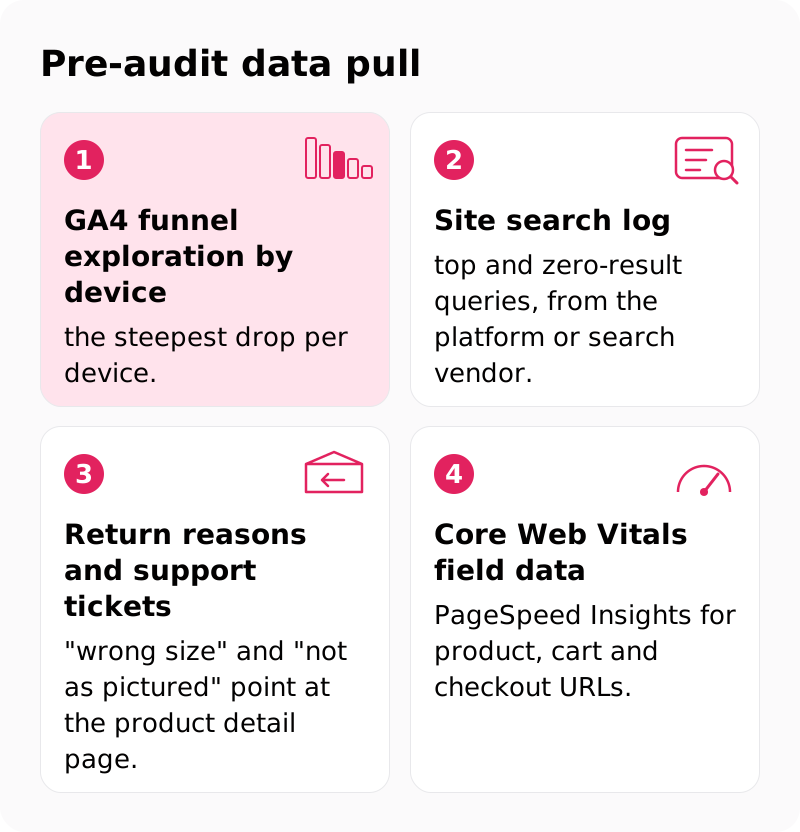
- GA4 funnel exploration by device: the steepest drop per device.
- Site search log: top and zero-result queries, from the platform or search vendor.
- Return reasons and support tickets: "wrong size" and "not as pictured" point at the product detail page.
- Core Web Vitals field data: PageSpeed Insights for product, cart and checkout URLs.
In GA4, build the funnel exploration from the recommended e-commerce events: view_item_list, view_item, add_to_cart, begin_checkout, add_shipping_info, add_payment_info and purchase. Make it an open funnel, which Google's Analytics Help page on funnel exploration defines as one users can enter at any step, so shoppers who return straight to checkout count. Then break it down by device category.
Hotjar or Microsoft Clarity, which is free, then shows why: filter recordings to the worst step and watch for rage clicks, dead clicks and stalled form fields. On our audits, analytics access comes in at kick-off, the first 1–2 days. Before trusting any drop-off number, check that the e-commerce tags fire: an add_to_cart event that never fires from a quick-add button makes a healthy step look broken. Before kick-off, open your own funnel exploration on mobile and note the step with the steepest drop.
How does the audit test site search and navigation?
The audit runs the same five query types on every store, and each one passes only when the first results, or a helpful zero-result page, answer it.
Start from the zero-result queries in the search log, because they show shoppers' words the catalog misses. The sheet uses made-up apparel queries; swap in your own.
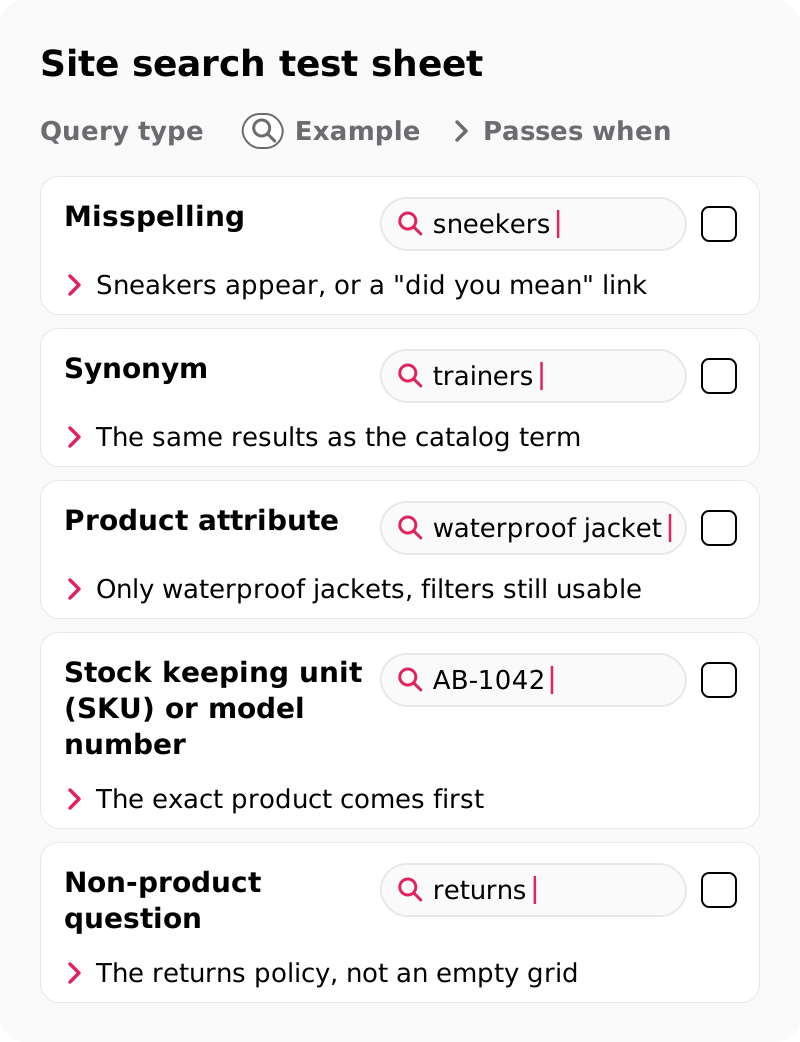
| Query type | Example | Passes when |
|---|---|---|
| Misspelling | sneekers | Sneakers appear, or a "did you mean" link |
| Synonym | trainers | The same results as the catalog term |
| Product attribute | waterproof jacket | Only waterproof jackets, filters still usable |
| Stock keeping unit (SKU) or model number | AB-1042 | The exact product comes first |
| Non-product question | returns | The returns policy, not an empty grid |
Autocomplete should suggest products within a few letters, a zero-result page should offer a spelling fix or popular categories, and results need the same filters as category pages. For navigation, check labels in shoppers' words, a clickable parent category, breadcrumbs, and a search field visible on mobile without opening the menu. Screenshot every failure; that log is your first page of findings.
Which listing and product page checks find the leaks?
On listing pages, check filters and product cards against what shoppers compare; on product pages, check the variant selector, delivery cost and date, size guide and returns line.
On the product listing page (PLP):
- Filters match the attributes each category is bought on, such as size, color and price, because generic filters hide the one that matters.
- Applied filters stay visible and removable one by one, so undoing one does not reset the rest.
- Product cards show price, rating and swatches, so shoppers compare without opening each product.
- Sort order offers the sorts shoppers use, such as best-selling and price, and stays applied after filtering, so results do not reshuffle.
- The back button keeps the scroll position, so shoppers do not restart a long list.
A product page UX audit reads the product detail page (PDP) next to your return reasons, since a sizing question left open can come back as a "wrong size" return:
- The variant selector marks out-of-stock sizes and flags a missing size, so add to cart never fails silently.
- Delivery cost and date sit next to the add-to-cart button, so cost is settled before the cart.
- The size guide and return policy sit one tap away, because they answer the questions behind your return tags.
- The rating and review count sit near the price, and reviews filter by the size or fit they mention, because fit comments answer the question behind "wrong size" returns.
- Images zoom to fabric and labels, because the photo stands in for handling the product.
The Federal Trade Commission (FTC) Rule on the Use of Consumer Reviews and Testimonials (16 CFR Part 465) bans fake reviews and review suppression, one of the payment, accessibility and review rules for online stores. Start both lists with your three best-sellers.
Which 12 checkout checks belong in an e-commerce UX audit?
The 12 checks fall into four groups (cost, account, form and trust), and the first asks whether shoppers see the total cost before the payment step.
Baymard's US survey of abandonment reasons sets aside the 42% who were only browsing. Among the rest, extra costs such as shipping, tax and fees led at 40%; distrust with card details reached 19%, a required account 18% and a long or complicated checkout 17%. Each group in the card answers one of those reasons.
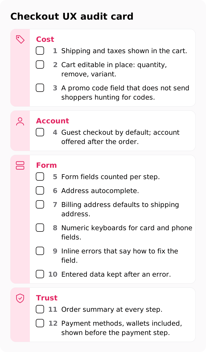
Cost:
- Shipping and taxes shown in the cart.
- Cart editable in place: quantity, remove, variant.
- A promo code field that does not send shoppers hunting for codes.
Account:
- Guest checkout by default; account offered after the order.
Form:
- Form fields counted per step.
- Address autocomplete.
- Billing address defaults to shipping address.
- Numeric keyboards for card and phone fields.
- Inline errors that say how to fix the field.
- Entered data kept after an error.
Trust:
- Order summary at every step.
- Payment methods, wallets included, shown before the payment step.
Check 5 is a count: the same Baymard page puts the average US checkout at 14.88 form fields by default, against 7–8 in an ideal flow. Mark each check on a phone first, where mobile checkout typing hurts most. A checkout UX audit alone misses everyone who never reaches the cart, so the checklist covers search, listing and product pages as well.
The order confirmation page closes the checklist: it repeats the order number, delivery date and items, and offers the account from check 4 with a password field only. Support tickets tagged "where is my order" can point to a confirmation page or order email that leaves out the delivery date, so pull their count from your help desk before the audit.
How does an e-commerce UX audit cover mobile, speed and WCAG 2.2?
Mobile gets its own pass with its own GA4 numbers, speed is judged on Core Web Vitals field data, and every audited template is checked against WCAG 2.2 level AA.
Start from the device split: when the mobile conversion rate trails desktop, the mobile pass gets more hours for thumb reach, sticky bars over the size selector and field keyboards.
Google's web.dev guidance sets the Core Web Vitals thresholds for a good experience at a Largest Contentful Paint (LCP) of 2.5 seconds or less, an Interaction to Next Paint (INP) of 200 milliseconds or less and a Cumulative Layout Shift (CLS) of 0.1 or less, at the 75th percentile of page loads. In a store, INP is the lag after tapping a filter, a swatch or add to cart, so use PageSpeed Insights field data, not one lab run.
WCAG 2.2 level AA is the conformance level the audit uses. Of the criteria new in WCAG 2.2, Redundant Entry fails a billing form that asks again for the shipping address, and Accessible Authentication (Minimum) fails a login that depends on memorizing or retyping a code. The table maps five criteria to a store.
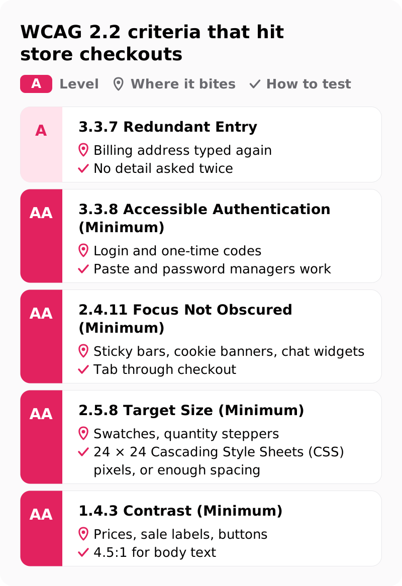
| Criterion | Level | Where it bites | How to test |
|---|---|---|---|
| 3.3.7 Redundant Entry | A | Billing address typed again | No detail asked twice |
| 3.3.8 Accessible Authentication (Minimum) | AA | Login and one-time codes | Paste and password managers work |
| 2.4.11 Focus Not Obscured (Minimum) | AA | Sticky bars, cookie banners, chat widgets | Tab through checkout |
| 2.5.8 Target Size (Minimum) | AA | Swatches, quantity steppers | 24 × 24 Cascading Style Sheets (CSS) pixels, or enough spacing |
| 1.4.3 Contrast (Minimum) | AA | Prices, sale labels, buttons | 4.5:1 for body text |
For the Americans with Disabilities Act (ADA), the Department of Justice says ADA Title III covers what businesses open to the public offer online, but it has no regulation setting detailed web standards, so WCAG 2.2 AA is the working benchmark. The European Accessibility Act has applied to e-commerce services for European Union (EU) consumers since 28 June 2025 under Directive (EU) 2019/882.
The audit checks templates, not every page, and fixes go into templates, never an overlay widget; a full-site accessibility audit is quoted separately. Tab through your checkout with a keyboard before the audit starts.
How do you score and rank e-commerce UX audit findings?
Multiply each finding's severity rating (1 to 4) by the share of affected sessions, divide by the effort estimate in development days, and fix the highest scores first.
Each issue gets a screenshot, a severity rating, a recommended fix and an effort estimate in design and development days. On our audits, two senior UX designers review independently, then merge findings. Affected sessions come from the funnel exploration: the share of all sessions that reach the page with the issue.
Illustrative, with invented inputs: a severity 3 shipping-cost surprise on a cart page reached by 12% of sessions scores 3 × 12 = 36, or 18 at 2 development days. A severity 4 gift-wrap bug met in 0.5% of sessions scores 4 × 0.5 = 2, or 2 at 1 day, so it waits. The 2×2 below turns scores into actions.
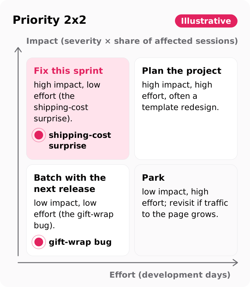
Illustrative:
- Fix this sprint: high impact, low effort (the shipping-cost surprise).
- Plan the project: high impact, high effort, often a template redesign.
- Batch with the next release: low impact, low effort (the gift-wrap bug).
- Park: low impact, high effort; revisit if traffic to the page grows.
Each "fix this sprint" item becomes an A/B testing hypothesis. That ranked fix roadmap, with reach and effort in days, is what an expert audit hands over, and what a team scoring its own store struggles to calibrate. No reach column in your backlog yet? Add one before the next sprint.
What does a self-audit of your own store miss?
You can run this checklist yourselves, but a self-audit misses what your team stopped noticing: menu names, saved addresses, fast connections and catalog search terms.
- Category names: staff know where everything lives, so "Essentials" reads as clear to them and vague to shoppers.
- Logged-in sessions: saved addresses and cards hide the guest checkout path and its errors.
- Fast devices: a laptop on office Wi-Fi hides the INP and LCP delays of a mid-range phone on mobile data.
- Catalog vocabulary: staff search with product names and SKUs, so synonyms and misspellings never fail for them.
- No shared scale: two colleagues rate one issue 2 and 4, and the louder voice wins.
Independent evaluators close those gaps, because they bring neither your vocabulary nor your habits. Bring them in when findings will decide a redesign budget, or when cart abandonment rises while traffic and prices hold. Without funnel evidence, audit first, then redesign only the weakest templates.
What should you send to get an e-commerce UX audit quote?
Send your store URL with six scope inputs, from the store platform to any accessibility deadline, and an e-commerce UX audit can be priced at a fixed scope.
These six inputs set the audit scope:
- Store platform (Shopify, BigCommerce, Adobe Commerce or custom), because on a Shopify UX audit a recommended fix can then name the theme section, app or checkout setting it touches.
- Templates in scope (home, listing, product, cart, checkout, account), so the audit reviews templates, not every page.
- Devices, markets and languages, so the scope names which versions of the store get reviewed.
- GA4 access or a funnel export, so reach is scored from week one.
- Top 50 search queries and the zero-result list, so the search test uses your shoppers' words.
- Any accessibility deadline, such as EU sales under the European Accessibility Act, because it sets the depth of the WCAG check.
Our audit price is $5,000–$15,000 for an audit duration of 2–3 weeks, as published in the hub's comparison of a UX audit with e-commerce UX design. Redesigning the weakest templates afterwards is an e-commerce UX design engagement of $25,000–$60,000 over 4–8 weeks.
Every project begins with a free consultation and a fixed-scope proposal. For a smaller first look, a 45-minute UX audit session reviews your store and identifies the top three friction points. Either way, the scope starts from your own drop-off numbers: send us your store URL and platform and attach the funnel exploration.
After the first sprint of fixes, repeat the 60-second phone test on mobile data. Any stall it still finds goes to the top of the next audit scope.
FAQs
How often should an online store run a UX audit?
Tie it to events, not a calendar. Run one before a replatforming project, after a theme or checkout change, when the funnel exploration shows a new drop, and before the peak-season build freeze.
Does an e-commerce UX audit include accessibility?
Yes. Each audited template is checked against WCAG 2.2 level AA, including Redundant Entry for billing addresses and Focus Not Obscured for sticky bars and chat widgets. A full-site accessibility audit of every page is quoted separately.
Is an e-commerce UX audit the same as a CRO audit?
No. The UX audit finds and ranks usability issues with evidence, while conversion rate optimization (CRO) proves one change at a time with A/B testing. The audit's ranked list feeds the CRO test queue.
Can a Shopify UX audit recommend changes to the checkout?
Yes, within your plan's limits. Shopify's developer documentation lists checkout UI extensions as a Shopify Plus feature, while Thank you and Order status extensions run on all plans except Shopify Starter. Where a fix touches the platform, the finding can name the theme change, app change or checkout setting it needs.
Should you audit the old store before replatforming?
Yes. An audit before the move lists the issues to fix in the new templates, so they are not rebuilt on the new platform. Our e-commerce UX design page lists a move from a custom store to Shopify as one trigger for outside design help.